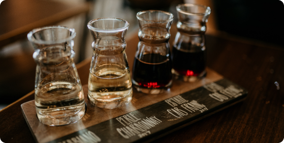
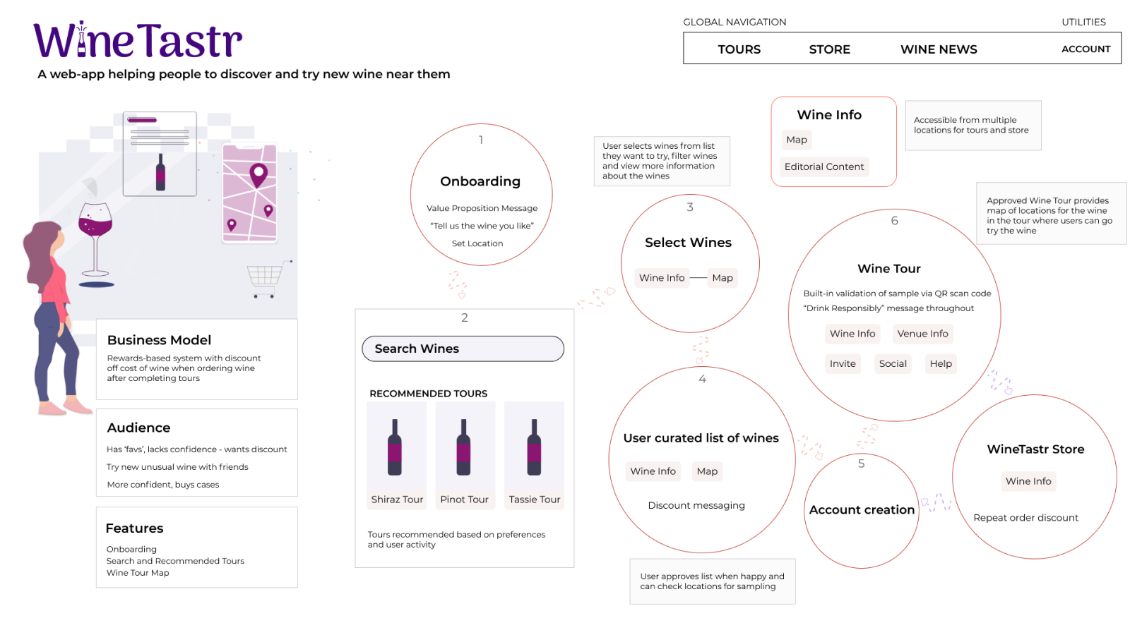
WineTastr is a web-app that helps people to discover new wine and see locations where they can sample it.
to try.


Overview
My Process
To design a solution for trying new wine I used design thinking to guide me.


Understand
Brief
I received a brief stating business requirements for the service to be designed. I interpreted this brief into a product that solves a user need and provides a distinct value proposition for the audience.
Problem Statement
I worked with my core team to brainstorm problems related to trying new wine. I then specified the problem via a problem statement.
Problem Statement
I love to try different wines from around the world. I buy wine by the case, but I want to make sure I really like the wine before I buy. I want to be able to sample wines from all over the world in my community.
This led me to creating an ecosystem diagram for WineTastr which helped me to gain consensus with the team about the problem and solution.


Key Insights
Key Insights
This provided me with an initial view of WineTastr - the solution
This then gave me direction for researching the problem in more depth, i.e. which competitors to research.
Competitive Analysis
With the problem specified, I moved onto research and first looked at the market and competitors to see what they were doing, what was working well for them - and what was not working well.
I decided to examine Naked Wines and Good Pair Days because of their focus on helping people to discover new wine and wineries with good quality wine at a good price.


Key Insights
Key Insights
There is a gap in the market for the WineTastr experience of trying new wines at local accessible venues.
The two competitors help people to try different wine focusing on delivering wine to the customer in bulk via an expensive subscription model.
There is a gap in the market for the WineTastr experience.
UX Analysis
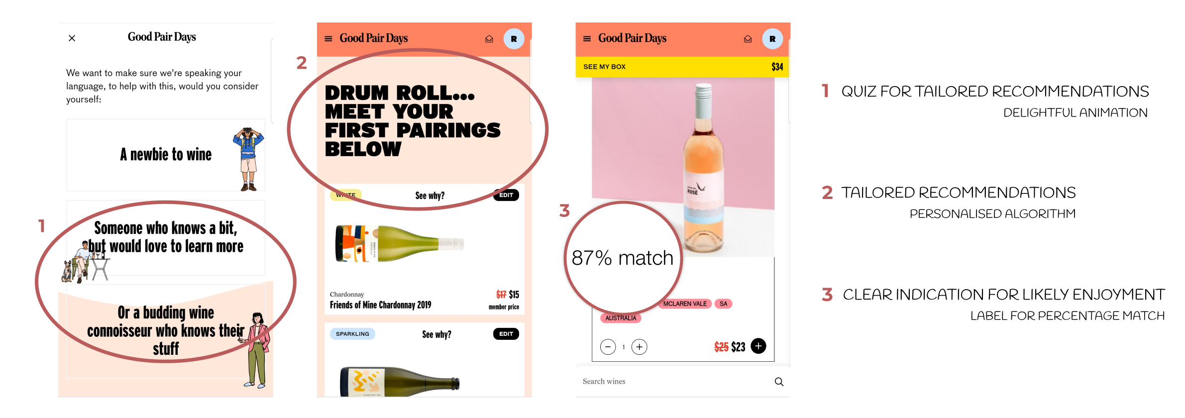
I then analysed Good Pair Days’ web-app with a UX lens.

Key Insights
Key Insights
WineTastr can take inspiration from Good Pair Days on how it pairs you with wines.
Good Pair Days uses an algorithm that learns the types of wines you like. They provide tailored recommendations and display a wine-to-user percetange match. This is helpful for the user as it automates the selection process.
I firstly took a look at their reviews and ratings on popular sites, as well as the respective app stores to gauge what actual users were saying about their experiences.
 Customer Service
 Product Design
 Value Proposition
Customers of Good Pair Days really like the company and invest in the subscription-model, finding it easy to use the service to pick wines and track wines.
It was then my turn to use the app and apply my UX lens to experience the competition.
I analysed the web-app for Good Pair Days and took a look at the native iOS and Android apps for core flows such as searching for wine. Though there are differences between the platforms, the experience I had still felt cohesive and I was able to easily navigate the platforms.

Good Pair Days delivers on its value proposition of pairing you with wines.
User Research
My user research goals focused on:
buying habits

new wine


After sending out a survey which confirmed my suspicions about how people generally try and buy wine, I then arranged interviews.
This gave me the opportunity to be able to ask ‘why’ and dive deeper into people’s perspectives, especially for finding out why they’d use WineTastr. I then created an affinity map to extract more information that turn these findings into tangible features for WineTastr.
Findings

Key Insights
Key Insights
People want tailored recommendations, automated tracking and access in all one place.
The findings supported my thinking and research with Good Pairs Days, and also highlighted WineTastr as a one-stop solution, where people can discover new wine, see where to sample it, learn about the wine and then - if they like it - buy the wine.
Afterwards I grouped my notes according to:
- Behaviours
- Attitudes
- Needs
- Needs
- Goals
- Frustrations
This was the first step for me to start to process the data.
Visualise
Personas and Journey Maps
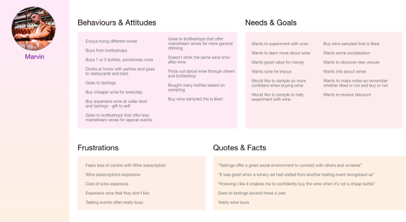
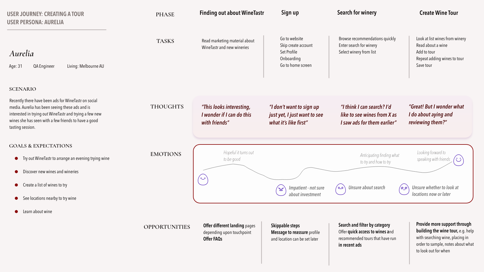
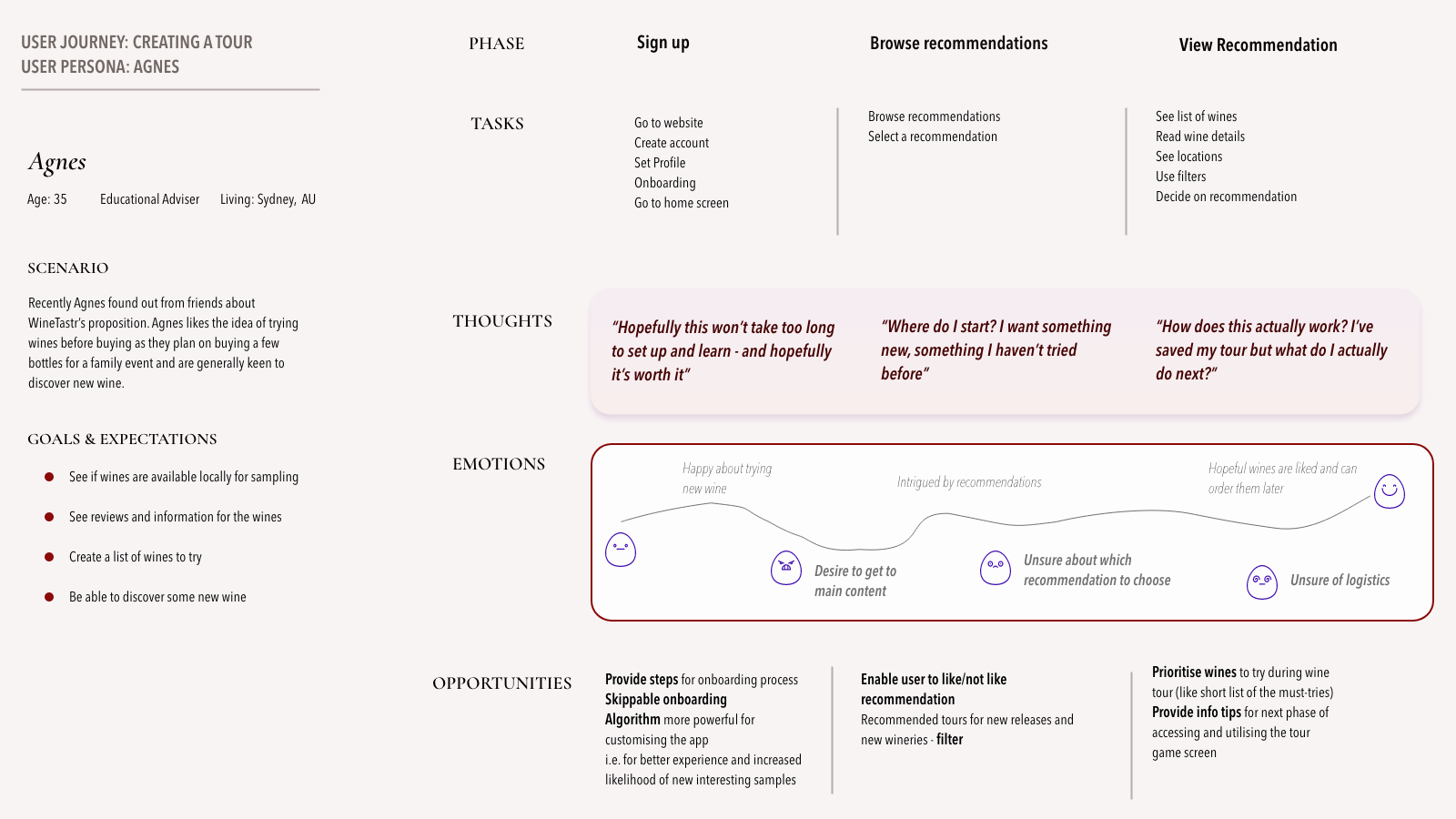
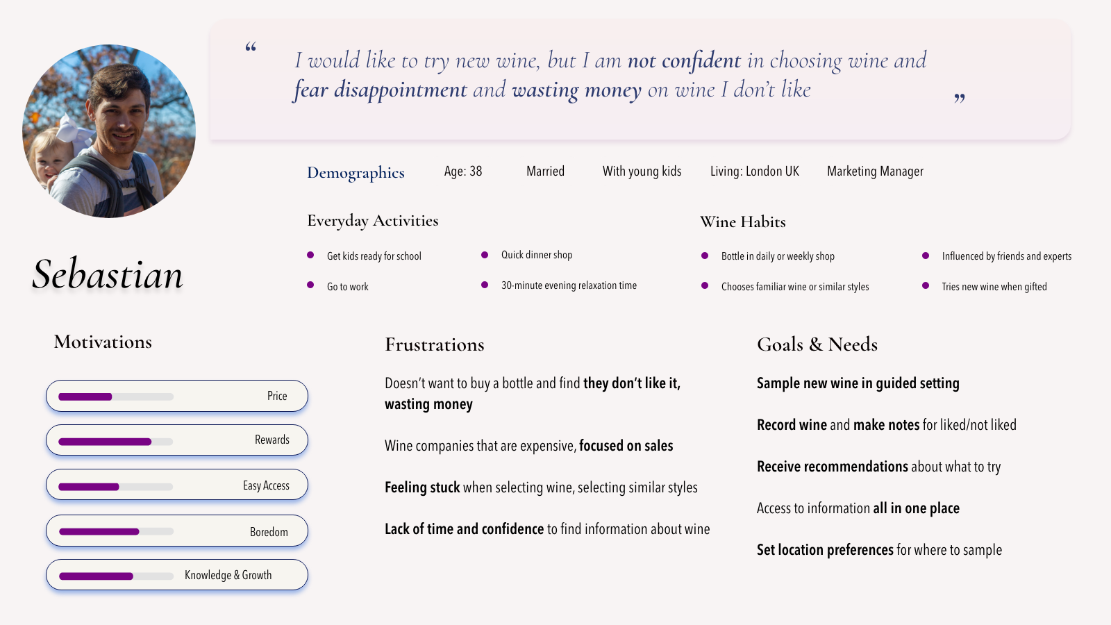
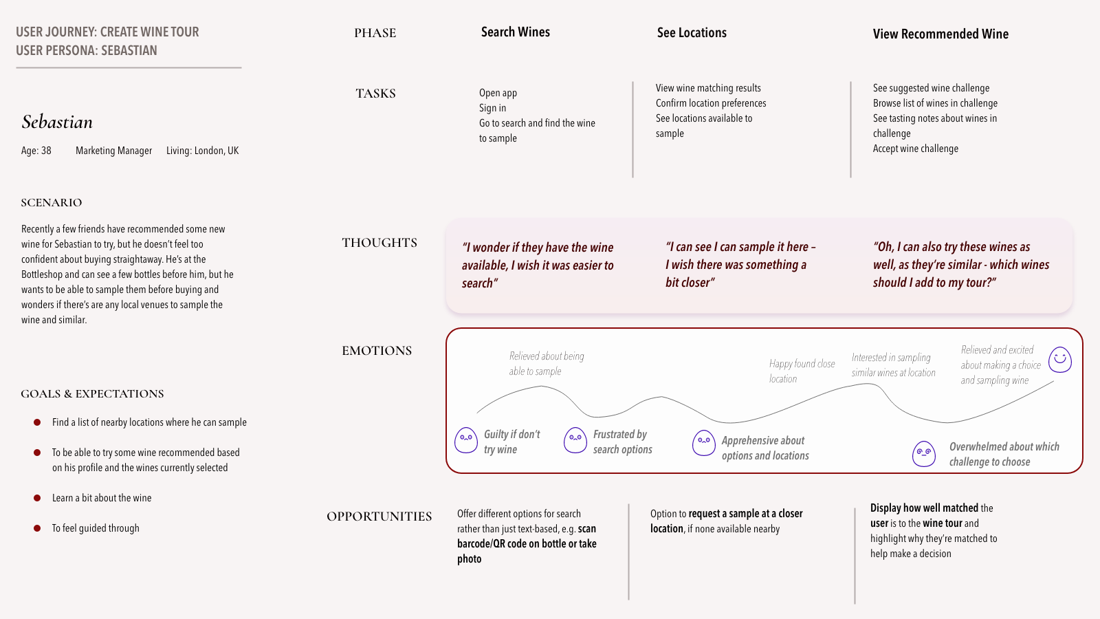
Reviewing the user research, I then defined my audience, creating 3 personas and explored the core tasks of creating a tour via a customer journey map to better understand their experience and identify opportunities for improvement.
Meet
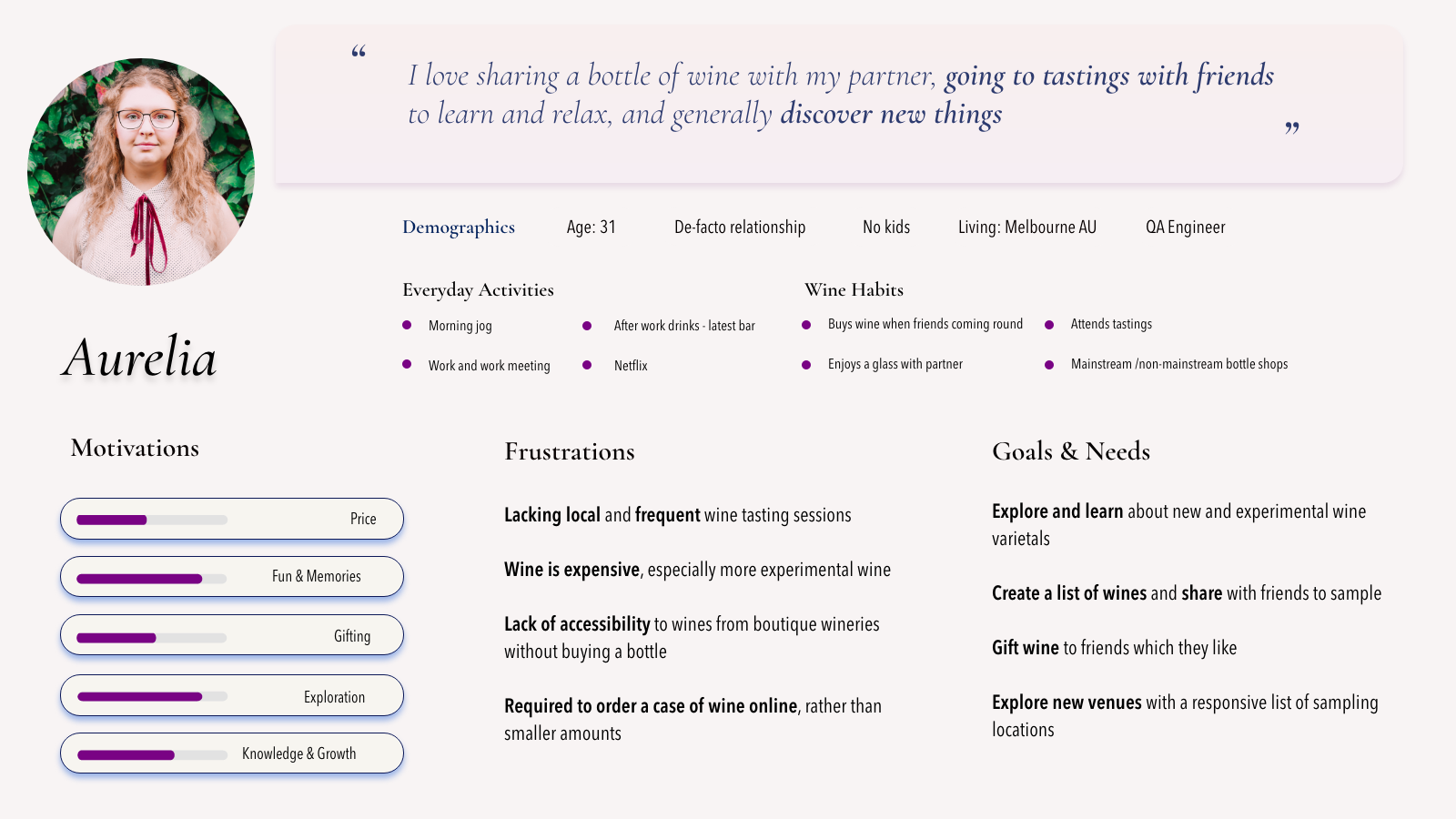
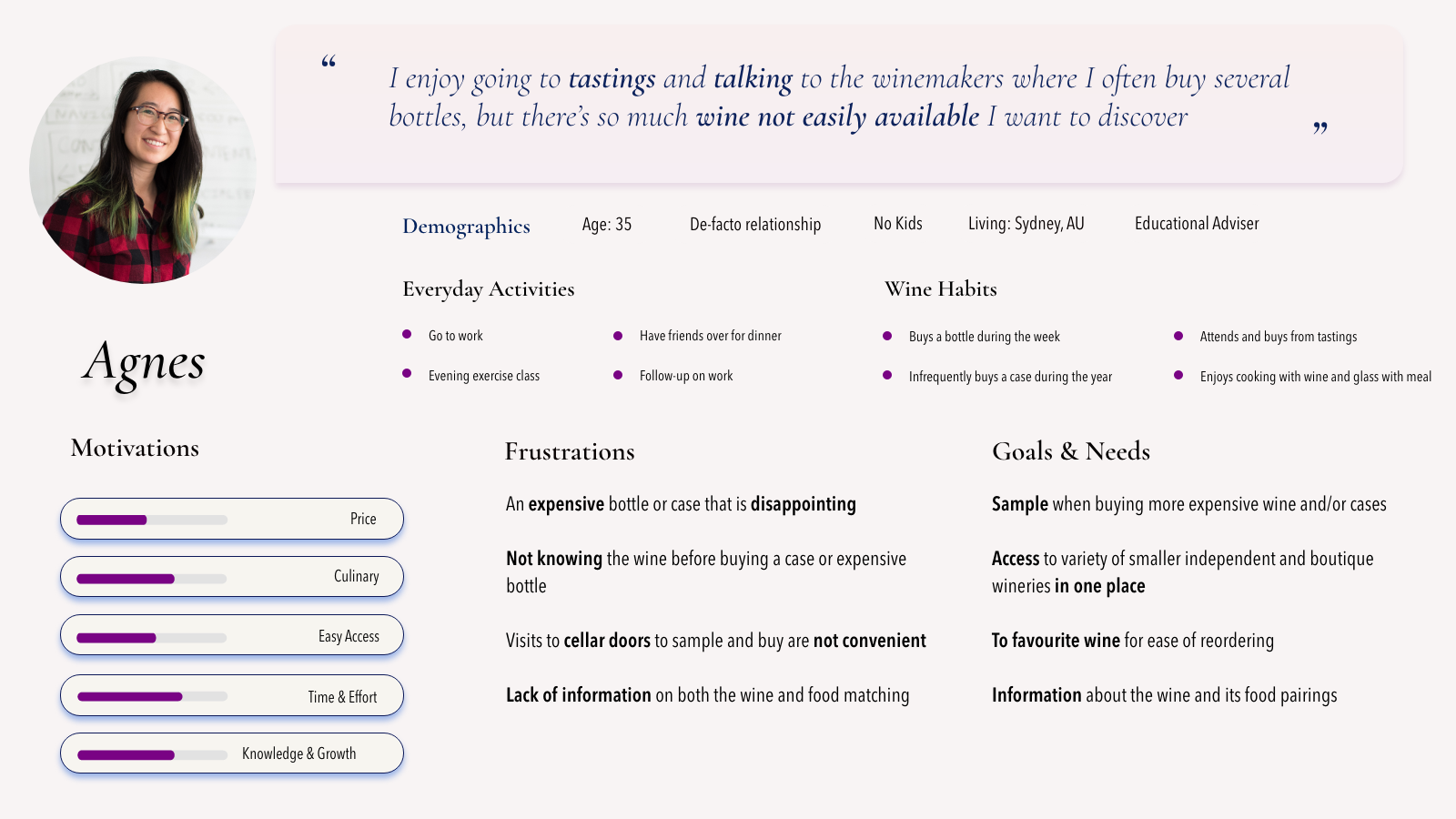
Key Insights
Key Insights
I identified an opportunity to support both the user and the venue by providing more information about the venue and the wines available to try
Though the personas have different contexts, they share emotions of excitement and anxiety for trying new wine, deciding what to try and where to try it - they all wanted reassurance.
IA and Sitemapping
I listed out the pages of WineTastr and considered its navigation.
I used a closed card sort to validate the first draft of the sitemap to check navigation and grouping.
Latest Sitemap

Earlier Sitemap

Latest Sitemap
Earlier Sitemap
Key Insights
Key Insights
The card sorting indicated similar groupings, so our mental models aligned, with minor adjustments.
Results indicated similar groupings, but reinforced to me that some pages can be accessed from multiple places via the navigation. Therefore pages may be shared between different IA groups.
Task Analysis and User Flows
I then dived into analysing the tasks and creating user flows. This helped me to to deepen my understanding of the core tasks.
After the first draft, I then proceeded to optimise it - i.e. where can it be made simpler for the user?
I continued to optimise the flows throughout the design process, in particular focusing on tour creation.

Key Insights
Key Insights
Certain users may be more or less thorough in their approach to creating their tour.
The selection process for wines presents a number of approaches:
- The user could quickly proceed to creating their tour
- Or they might take a more leisurely route, reviewing the wine details, locations, and even the venues they could visit


Execute
Wireframing
With a deeper understanding of the solution, I then started to create digital sketches for the core pages of the user flows. This helped me to explore the information hierarchy, placement and layout.
With each iteration I filled in more details and increased fidelity, revaluating previous thinking.
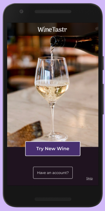
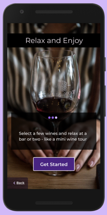
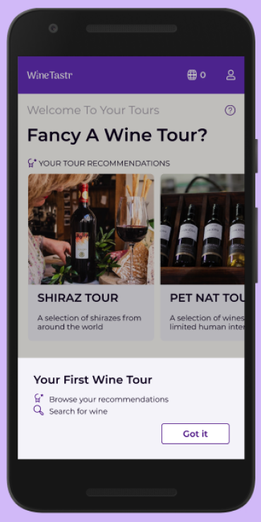
Onboarding
Onboarding focused on conveying the value proposition to the user, followed by helping them to let WineTastr know what types of wines they like so we can provide better recommendations from the get go. As part of this desired path, the user grants permission for WineTastr to use location.
Key Insights
Key Insights
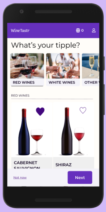
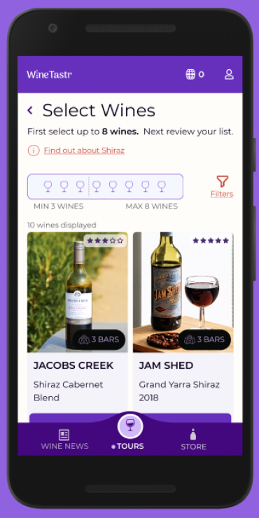
Select Wine Preferences
Use of horizontal scroll when selecting wine preferences may not be intuitive.
There’s also the question of how many wines to scroll through for each category. This may not elicit what we want from the user, i.e. they might skip this. I needed to rethink how to present this screen and make it simpler.
Location Request
The user may not grant permission if presented too soon before more engagement.
If the user does not grant permission - it makes it harder for us to fulfil the value proposition. I therefore decided to delay this till after selecting wine preferences.
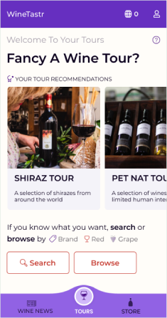
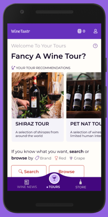
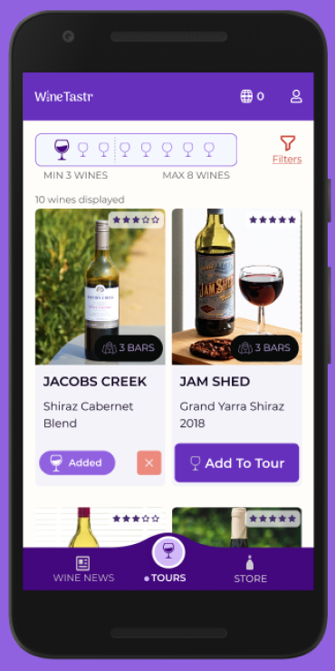
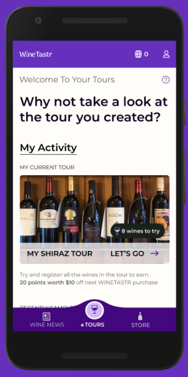
Tour Creation
Tour Creation begins with the user either choosing a recommended tour or entering a search.
The primary flow is via the recommendation where the user proceeds to select wines they want to try, before reviewing
their selection and creating their tour.
Key Insights
Key Insights
The desired path needs to be clearer
I needed to review the information hierarchy on the dashboard as the desired path for the users is to click on a recommended wine tour and they fed back that this was not clear enough.
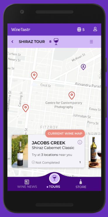
The tour map is where the user navigates their tour where they select a wine and see potential locations.
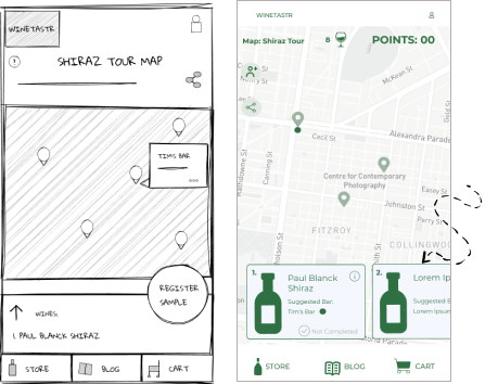
Through exploring the gestural interaction on the map and reviewing the personas, swiping up to see the wine list presented one main challenge: you could not see the map at the same time.
Thus you couldn’t quickly switch between wines to try and see locations where to sample them.
Hence I adopted the horizontal scroll group for the wine cards instead as it keeps the map visible and my hypothesis is that this is more reassuring for the personas who might be considering trying 1-3 wines for an evening.
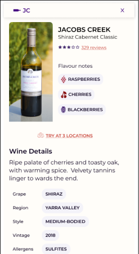
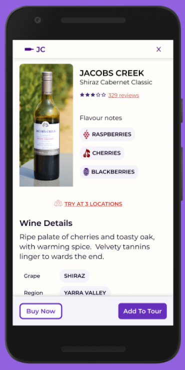
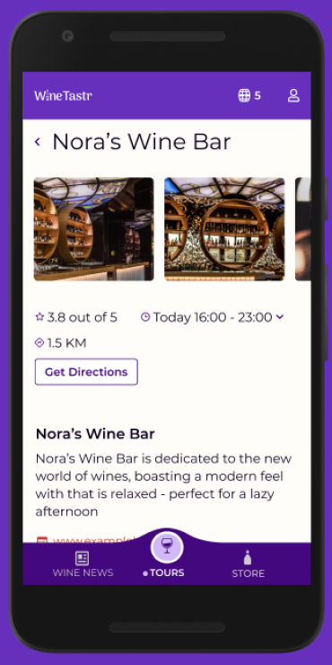
The wine card during the tour creation flow provides information to the user such as sampling locations.
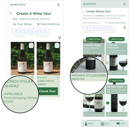
My hypothesis is that it is useful and reassuring to see a potential sampling location, however I had to ask, what would happen if there are several potential locations? How might we best present this to the user?
I decided it was more important to know that there are X number of locations nearby, and let them dive in for more details about the locations, if they want to.
I played about with the information hierarchy on the wine card, reviewing wine cards from online stores to check patterns and potential mental models.
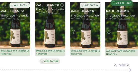
There was a lot of variety in information hierarchy online.
Through my own examples I identified it was important to give the user the most important action first: adding to tour button, followed by the wine name and its details, including social proof via reviews and sampling locations.
I also needed to make clickable areas clear and let the user know what and where they’d be going. As an unexpected result can be frustrating.
Prototyping
With sketches and wireframes, I created prototypes to test the navigation and interaction of the core flows. I walked through them, checking my thinking for how the personas are supported and the clarity of the value proposition.
With higher fidelity prototypes I was able to represent my thinking for micro interactions.
End of Prototype: Tour Map
Key Insights
The WineTastr value proposition needs to be clearer earlier in the prototype.
The last prototype review before user testing indicated that I needed to focus on making the value proposition clearer before the ending map flow, so I reviewed the UX writing.
Testing
I now had a higher fidelity prototype ready for testing. This would help me to observe participants interacting with the design to evaluate the effectiveness - an opportunity I have often found very illuminating from past experience because it helps avoid risk.
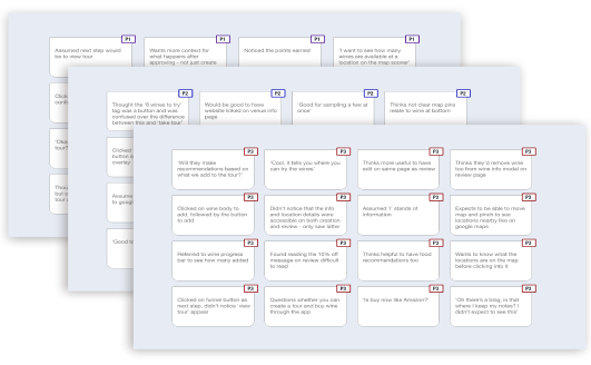
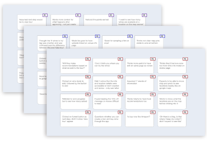
I firstly processed the data in the form of an affinity map to uncover links between my observations.
Then using a rainbow spreadsheet I was able to better see what was working well and identify risk which gave me confidence in the design and where was risky.
Recommendation
Key Insights
Key Insights
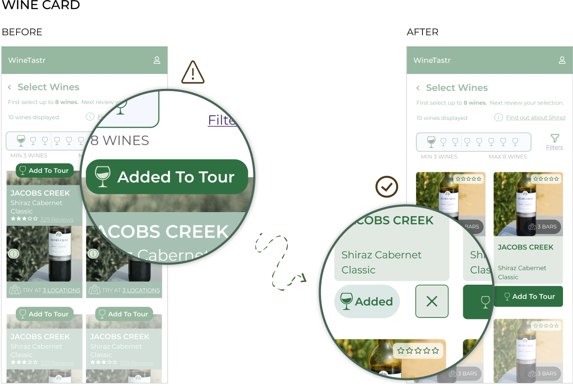
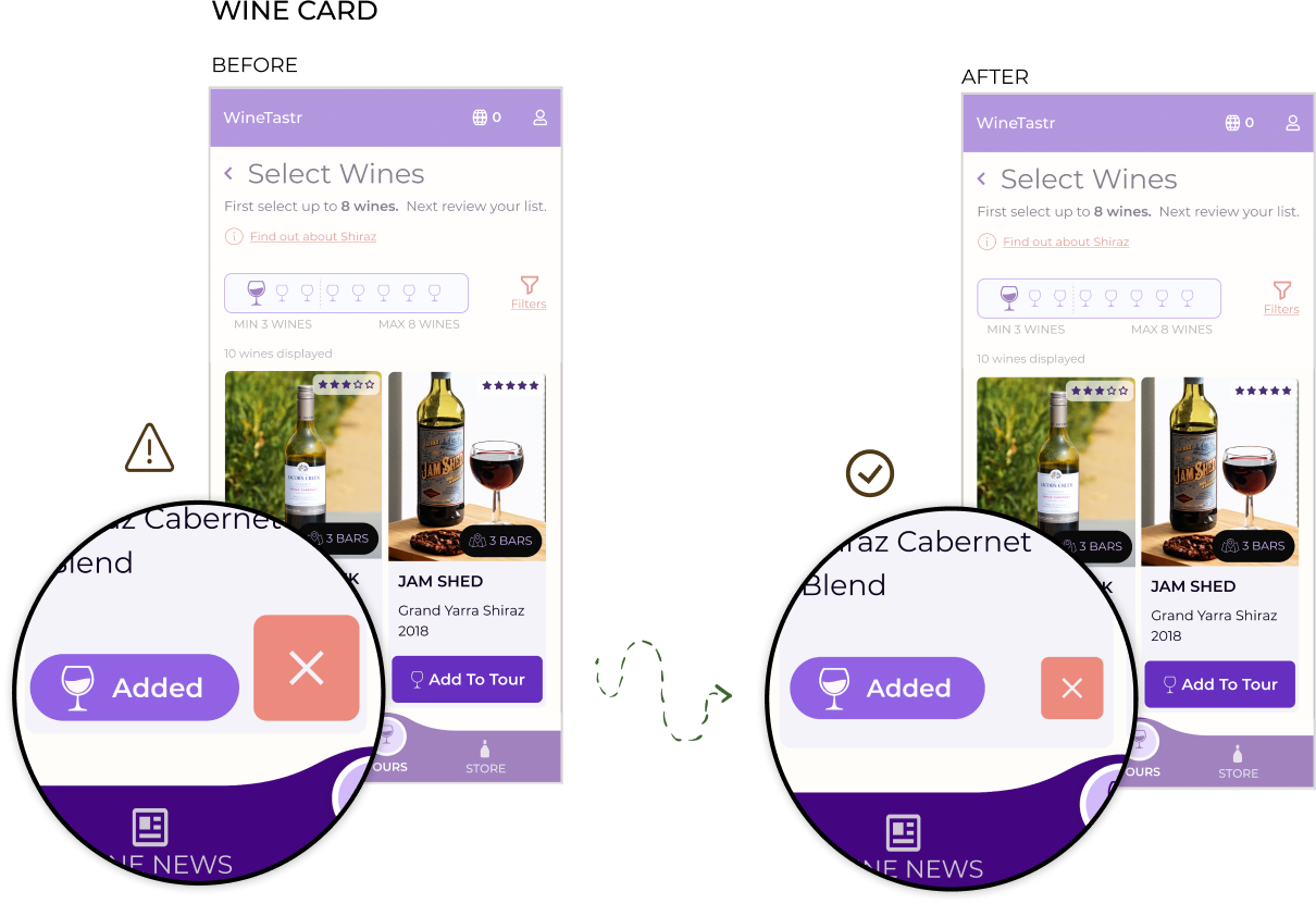
Participants did not know how to remove a wine from their tour, degrading trust in the brand.
Not being able to undo an action or remove an item from a list is a frustrating thing that can erode trust and undermine the experience. So I made this clearer by adding a more explicit remove button and rearranging the card to match their mental models.
Testing finished, I embarked on analysing the videos recorded. This led me to create an affinity map to see the links between my observations. Through a rainbow spreadsheet I further explored my observations, links and next steps.
During analysis I made notes for user’s thoughts, feelings and actions, as well as any errors encountered. Through this initial collection of observations patterns were emerging.
One obstacle became clearer: Participants wanted to navigate the wine card differently.
Affinity mapping helped me to group my notes into observations, positive and negative quotes and errors. All the while reflecting on my observations and how they presented roadblocks and opportunities.
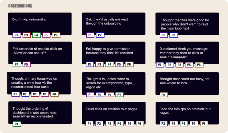
I could see there were navigational errors affecting both global navigation and inline on the page. Related to this is that half the participants were not clear on what the dashboard and profile are, indicating a misaligned IA mental model.
Through the table I explored the metrics obtained from success rates, SEQ (Single Ease Question) and NPS (Net Promoter Score) questions. This can form a baseline for the next round of usability testing to see if the scores improve.
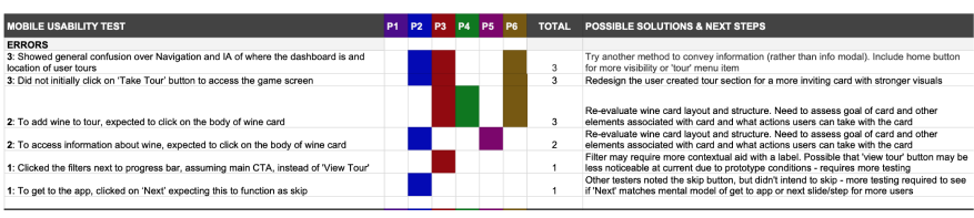
Number of issues raised focused on IA (where are tours located?) and navigation.
Adding a tour menu item may help to resolve a couple of issues with one change - it makes tours more visible by including it in the global navigation
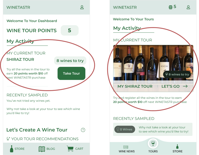
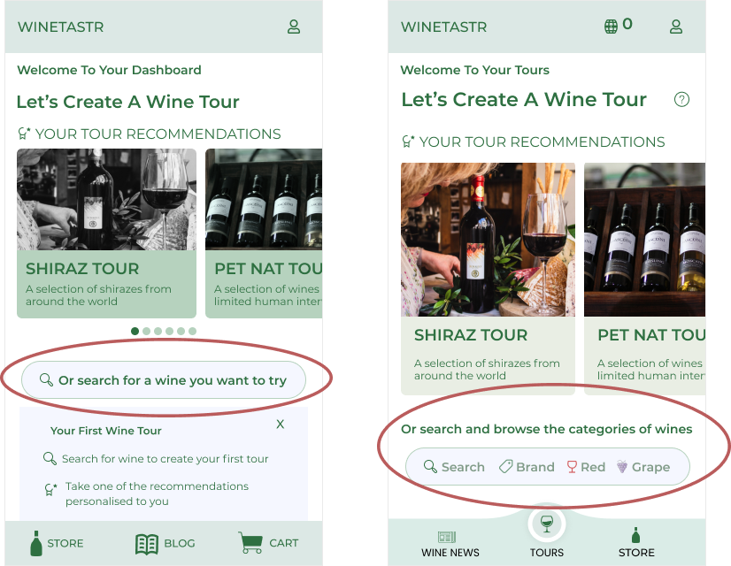
The new design makes the card more visual with an enticing image to stir up the user’s emotions.
It was unclear for 3 participants where to click to take their tour, so the new design makes the whole card clickable, placing the promotional text beneath.
I believe this also simplifies the screen, guiding the user with more focus to their tour.
Visual Design
Towards the end of my process I moved towards applying the visual layer to WineTastr and established a design language that supports the branding and story of WineTastr.
As part of this practice I validated WineTastr in terms of accessibility by checking font sizing and colour contrast with plugins available on Figma.
Design Critique
Key Insights
Key Insights
Critique indicated a lack of balance for the remove button on the wine card
I prioritised their comments and made suggestions for how to improve the visual design. For the remove button I focused on balancing the wine card, but keeping the remove button prominent so the user can easily undo an action, giving them perception of control.
For example, the remove wine button lacked balance with the rest of the card, so I reduced its size whilst still keeping it prominent for users to tap on.
With a new version of the prototype based on the usability testing, I started to focus on the visual design and created a design language. Here you’ll find a snippet of this.
For the colour palette I decided on purple and an orange:
The purple brings elegance and is reminiscent of grapes.
The orange brings a touch of playfulness to lessen potential ‘snobbery’ associated with purple. It is similiar to new ‘Orange’ wine styles, roses and other red wines.
WineTastr is not just another stuffy wine club, nor does it encourage excessive drinking, so the two colours balance each other.

Cards relating to wines and tours use real imagery, with people, bottles of wine and full glasses.
Aim for inclusive design so ensure a wide range of people - anyone can enjoy wine!

Recommended tour cards use horizontal scroll as choice limited to 6 cards to ease user selection.
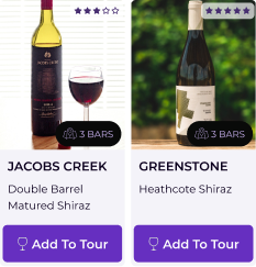
Wine cards (select) use a 2 column grid and scroll vertically as is established pattern, common in online stores.
With a new layer of visual design, I wanted to check my thinking and latest iteration of WineTastr with others, so I sought out collaboration with other designers to participate in a series of reciprocal design critiques.
7 fellow designers came forward with their suggestions, opinions and support.
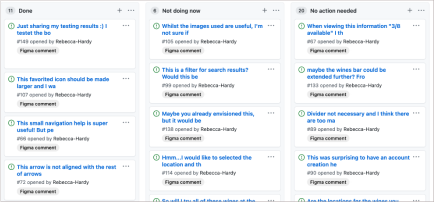
I extracted out their comments and placed them onto github for sorting.
I needed to establish:
I considered their comments and separated them into
In addition to changing the balance of wine card as noted in the main case study, I began to work on the feedback and think of solutions to the issues identified and make changes to the design. Here are a few examples.
Acknowledging the confusion caused by the search UI, I opted to simplify this into 2 buttons for search and browse.

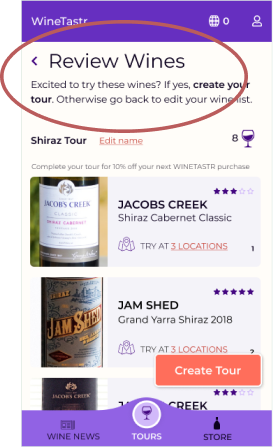
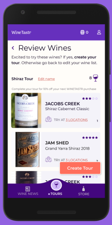
I'm confused by the title "Review Wines" I was thinking I wouldn't be able to review wines before trying them
I clarified this with the designer and sought additional input to check whether this was confusing for others.
The initial designer noted it confused her for a moment, but soon recovered and understood the context of the page. Other people did not indicate confusion.
With this new information, I could feel more confident in the initial wording ‘Review Wines’. I believe the overall context of the page is clear.
As part of reflecting on their comments, I wanted to acknowledge their positive feedback and assess what was working well, where was the design succeeding?
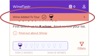
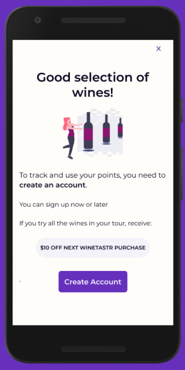
LOVED the message that came in when I added the wine!
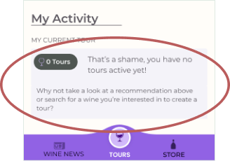
Nice empty state!
It was really good to hear that these small touches where noticed and appreciated, increasing my confidence in what users would be experiencing.
The flow, the information and layout worked together to inform, but not overhwhelm
Nice touch with the wine logo in the header - feels cohesive
This page appeared to work well for designers of differing knowledge and appetite for wine.
After implementing changes, I created a new refined version of the prototype.
Final Design


Reflection
The WineTastr Journey
I am confident that WineTastr is useful and enjoyable
I identified early that WineTastr has a social appeal, i.e. arranging a tour with friends. Though I captured this use case via one of my personas, through feedback from participants and designers, I could see this was more valuable to them than I had initially identified. This could represent more opportunities to explore.

What Next?
Test the latest version
I would like to test the latest version with usability testing and 5-second impression testing to be able to further refine the solution.
Work on the flow for going on the tour
I am confident that the tour creation process is understood, but I’m not as confident in the user’s ability to go on their tour. I need to prototype and test this because creating the tour is only one part of their larger experience with WineTastr.

The Challenges
Looking at the positives and not just where it’s broken
I look for where things break, but I need to learn to identify and celebrate the positives too.

I am grateful for my core team and fellow designers I have relied on for support and feedback. They provided me with opportunities to check my thinking, learn and improve the design - and myself.
Thank you for reading the case study for![]()